
A custom race-day T-shirt design created to reflect team identity, spirit, and motion.
Project Type: Apparel design, Team identity
Role: Graphic designer
Industry: Sports, Branding, Merchandise
01
Problem
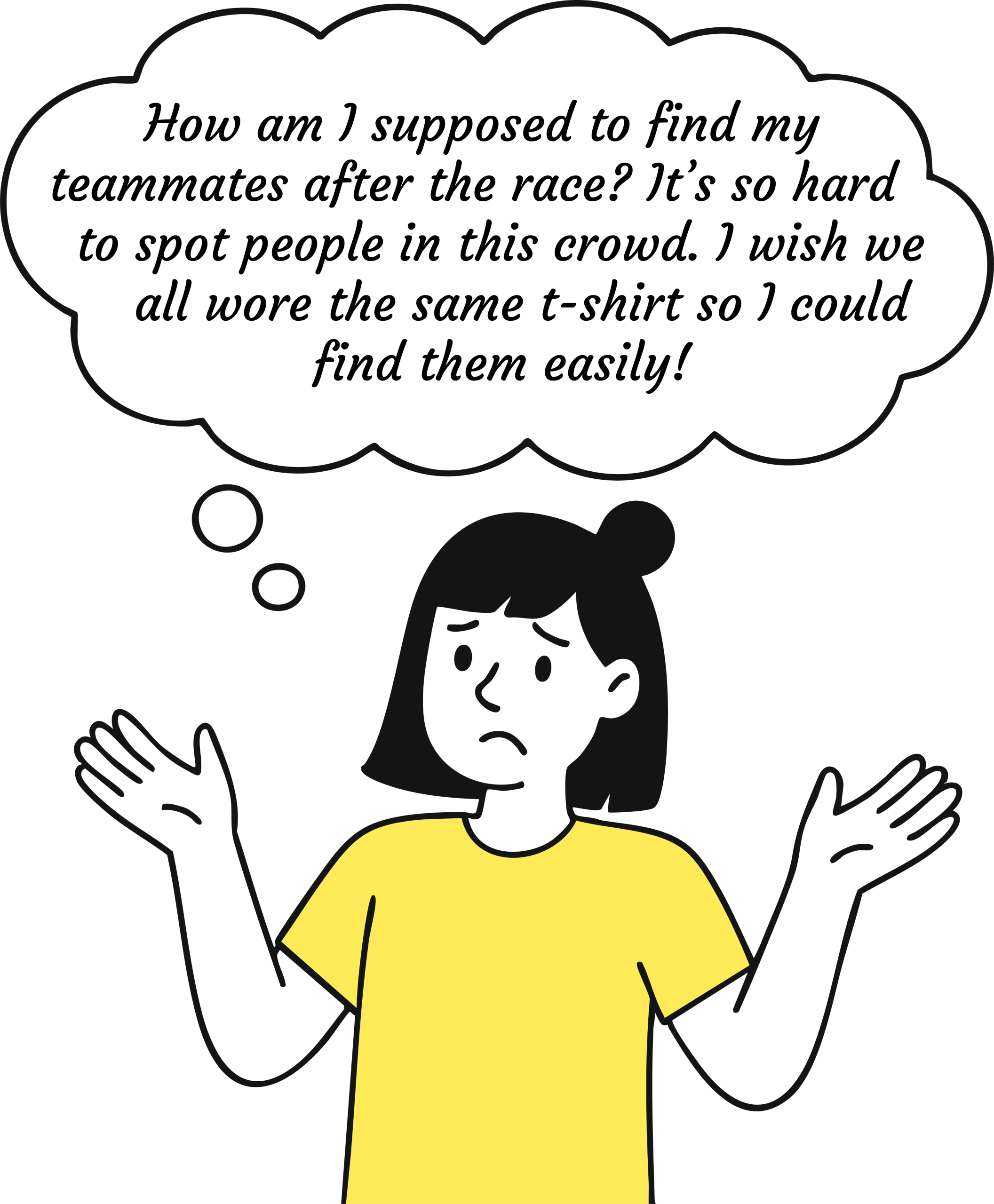
Lack of team sprıt
In our team, we realized there was no single element visually tying us together. This made it difficult not only to locate each other in a crowd, but also to feel a true sense of belonging. That insight sparked the idea: what if we had a unified t-shirt design that would make us stand out — and feel like a team, both on and off the track?
A strong team spirit stems from shared experiences and a sense of unity among teammates. However, during race events — often crowded and fast-paced — it’s challenging to identify and connect with team members afterward. This lack of visibility can make it harder to reflect, share insights, and build motivation as a group.
02
Research
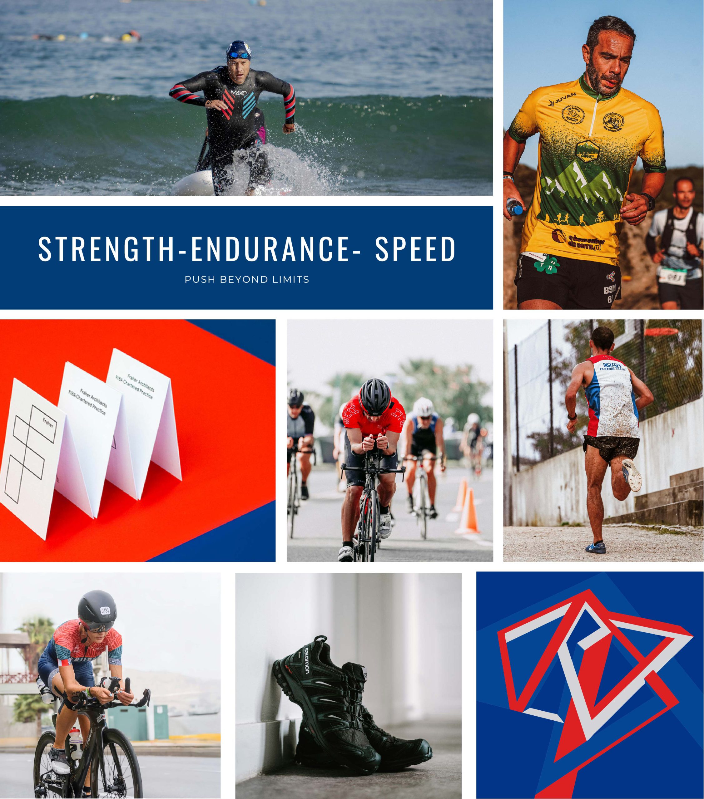
Investıgate what trıathlon means to athletes and how they experıence ıt
Triathlon is an endurance sport that combines swimming, cycling, and running in a continuous sequence. This requires not only physical preparation for each stage, but also mental resilience to face unexpected setbacks. Completing a race within a target time requires strong psychological resilience as well as peak performance.
Desıgn Patterns ın Competıtor Research
Triangles and lines are often used in competitive designs to symbolize challenge and progression — reflecting the uphill effort athletes exert to reach their goals.
Choosıng colors
The primary colors in our triathlon team’s logo are red and blue.
Red stimulates the heartbeat and reflects the effort, passion, and drive of athletes during the race.
Blue, on the other hand, symbolizes balance, calmness, and stability—all essential traits for endurance athletes.
03
Design
Draft exploratıons
Here, I explored various visual directions by experimenting with linework, symbols, and layout compositions that reflect movement, challenge, and unity. These sketches helped clarify the core elements that best represent our team identity.
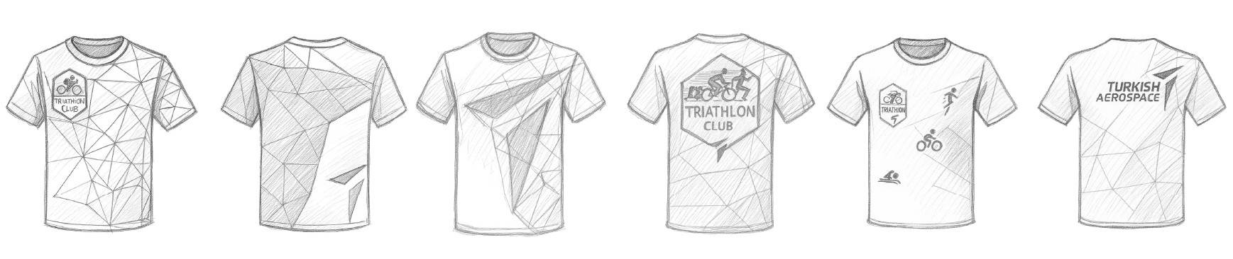
Prelımınary Mockups
Front designs highlight direction, structure, and rhythm.

Back designs emphasize visibility and alignment with team branding.
04
Final Design
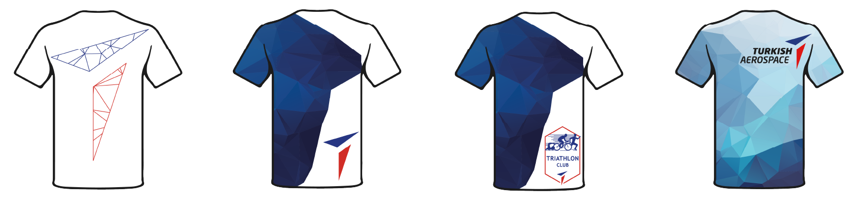
Chosen by Team votes
The final design was selected through team voting. I chose blue as the primary color to represent triathlon, using varying saturation levels to reflect the different environments experienced during the race:
Dark blue represents the swimming segment, symbolizing water depth and intensity.
Medium-toned blue reflects the cycling part — stable and grounded.
Lighter blue, on the top right, features an athlete climbing, symbolizing the running segment and the final push to the finish line.
Each icon (swim, bike, run) is placed in sequence from the bottom left to the top right, visually guiding the viewer through the stages of the race.
On the back of the jersey, I included our company’s logo for identity. On the front, the team logo is positioned on one of the hills to symbolize unity and team spirit.
